10.4 Tuesday

daily

Roll

Grid Design

Axial (an example)

Effective use of Axial, color, Gestalt (size/color to unite subsections, lead eye across image, hierarchy to emphasize key elements and subordinate less important).

CEC Card Key Access

Lorraine said there have been some questions about why, when you check to see if your card will work on the CEC doors, it sometimes won’t flash a green light (indicating the door is unlocked). This happens if you test your key while the door is already unlocked, during standard CEC open hours. Apparently, it only flashes green if the doors are currently locked. (Admittedly, this is poor UXD but there’s not a way for us to change it.)

Course Feedback

  • In-class sketching is useful.
  • Projects are good.
  • Want all homework listed in one place: See Schedule page.
  • Slow down on demos.
  • Access to CEC (for Illustrator): Elam sketches can now be done with any app. Still use square format.

Elam

Discuss grid designs.

Sketching

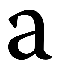
Sketch No. 8: IBM Plex Serif, part of a superfamily.

As we start to think about how glyphs look next to each other, we’ll start with this two-class test word. Do /Hand/ today; we’ll finish on Thursday.

Begin by sketching a horizontal lines for baseline, x-height, and cap height. If the font is installed on the CEC machines, open Type Tool then File > Open Installed to help you get a better sense of the relative dimensions.

Typeface Project

Share the four typefaces you picked. Get feedback from team on additional elements of the DNA of each.

Then, in the Typeface Project folder on Google Drive, create a folder for yourself titled, “Typeface YourLastName”. In the folder, create another folder titled “Design Brief”. Spend 10 minutes making notes about what the brief will include (refer back to the project description).

Sketchbooks

I’m collecting sketchbooks in class on Thursday for grading. Check the Sketchbook page to make sure you’re caught up. If you’re leaving for break early, leave your sketchbook in my mailbox in the CM&D office.
9.29 Thursday

daily

Roll

Review Publicity Images

If there are any images you don’t want Clarkson to use for publicity, email me to let me know.

Finish Logotypes

  1. Create two new art boards in your Illustrator file.
  2. Create a new background layer named “merch”.
  3. Download the merch.zip file from here.
  4. Extract the file and choose two types of mech that you think ADK Café would use.
  5. File > Place each image in one of the new art board’s “merch” layer.
  6. Create new layer titled “logotype” on each new art board and copy/paste your logotype onto the piece of march.
  7. Resize the logotype as needed.
  8. Save your Illustrator file with the filename “logotype merch YourLastName.ai”
  9. Leave the file open and onscreen for voting.
  10. Upload the file to a new folder titled “logotype YourLastName 2” in Google Drive.

Voting on Logotypes

  1. Zoom in so that your logotype (the two merch art boards) is large for easy viewing.
  2. Place the numbered index card on your keyboard.
  3. Walk around the room and look at the other logotypes. Take notes in your sketchbook about which ones you like the best.
  4. After you’ve viewed them all, go to this Google Form to vote on your favorite top three.

Font Project

Review project description.

This is much more detailed than what I’ll ask you to produce, but this report on Warnock has some good examples of things you should look for.

Go to fonts.adobe.com and spend some time looking at typefaces. We’re going to start working on that project on Thursday, so you should get an idea of what sorts of fonts interest you. During the project, you’ll need to identify at least four fonts that contain elements that you want to emulate in your design. Take notes in your sketchbook (the names of the fonts and the features you think are interesting).

I’ve scanned some pages from Elam that you should refer to as you’re trying to identify distinctive features in the fonts you found at Adobe.com. They’re in the “Typeface” folder on Google Drive.

Anonymous Course Feedback Form

Use this form to give me (constructive) feedback on how well the course is going so far.

Logotype Turn-In

daily
  1. After you’ve finished your logotype, create a folder titled “Logotype Final YourLastName”.
  2. In that folder, create three new folders:
    • Research
    • Sketches
    • Illustrator
  1. In the “Research” folder, place whatever materials you have that show your research process. If they’re handwritten, take phone cam picture of the notes.
  2. In the “Sketches” folder, put phone cam picture of your sketches.
  3. In the “Illustrator” folder, put the final version of your logotype.
  4. Upload the folder to the Google Drive folder I set up for final versions.

9.27 Tuesday

daily

Roll

Elam

Discuss Random layouts. Share in small groups, then pick one to share with class.

Sketch

Adobe Warnock, designed by Roger Slimbach.

Go to Adobe’s page for Warnock. Review the selections from Lupton that are on Google Drive. Look through the glyphs and identify the key, distinctive characteristics of the font.

Finish Logotypes

  1. Create two new art boards in your Illustrator file.
  2. Create a new background layer named “merch”.
  3. Download the merch.zip file from here.
  4. Extract the file and choose two types of mech that you think ADK Café would use.
  5. File > Place each image in one of the new art board’s “merch” layer.
  6. Create new layer titled “logotype” on each new art board and copy/paste your logotype onto the piece of march.
  7. Resize the logotype as needed.
  8. Save your Illustrator file with the filename “logotype merch YourLastName.ai”
  9. Leave the file open and onscreen for voting.
  10. Upload the file to folder you uploaded earlier in Google Drive.

Voting on Logotypes

  1. Zoom in so that your logotype (the two merch art boards) is large for easy viewing.
  2. Place the numbered index card on your keyboard.
  3. Walk around the room and look at the other logotypes. Take notes in your sketchbook about which ones you like the best.
  4. After you’ve viewed them all, go to this Google Form to vote on your favorite top three.

Font Research

This is much more detailed than what I’ll ask you to produce, but this report on Warnock has some good examples of things you should look for.

Go to fonts.adobe.com and spend some time looking at typefaces. We’re going to start working on that project on Thursday, so you should get an idea of what sorts of fonts interest you. During the project, you’ll need to identify at least four fonts that contain elements that you want to emulate in your design. Take notes in your sketchbook (the names of the fonts and the features you think are interesting).

9.20 Tuesday

daily

Roll

Missed Quizzes

I’m allowing you to make up a quiz once by writing a 200-word summary of the reading and emailing it to me. You can do this either for a class you missed or a quiz you failed.

Sketchbook Pay Reminder

There are still a few people who paid Lorraine for their sketchbook and pen yet. Please do so before the end of the week.

Elam Posters

Many of you aren’t posting these. They’re due for each chapter as assigned.

Work within a single Illustrator file, using the multiple art boards technique I demoed in class last week.

When you save the file, be sure that the box for creating PDF-compatible files is checked. This allows me to review them directly in Google Drive without having to download them.

Requirements: 4 intro level and 4 intermediate. I described this in the weblog entry for this class. (I gave full credit to those who only did four and extra credit for those that did 8. If someone can let me know where it says just do 4, I’ll fix it.)

Briefly: Review a couple of examples from Google Drive.

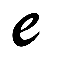
Sketchbook Glyph: /e/

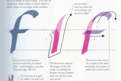
Brush Script. Designed in 1942 by Robert E. Smith for American Type Founders.

Dilitational

Design Crits

Giving a designer useful feedback requires some thought and tact. Even in the best circumstances, you’re telling a person that what they’ve done isn’t good enough. As a designer, it’s hard to not feel hurt. Here are some tips for participating in productive crits (some of these are from an Adobe blog post). 

  • Start the session by having the designer talk about the specific goals they have for the design. What’s the user/reader/viewer supposed to get from the design? What’s the context of use (e.g., a poster that distracted pedestrians will pass quickly on the street? Advertisement in a newsmagazine? Opening title sequence for a movie that might be seen in a theater, TV screen, laptop, or iPhone?
  • Designers should take notes and ask for clarification where necessary but not defend themselves (even if they disagree with something).
  • Focus on the text being critiqued rather than the designer. Use words like, “the design” or “the poster” rather than “you.”
  • Ask the designer questions if necessary. And not, “WTF were you thinking?” More like, “I’m not sure I see what the penguin is contributing to this. Can you talk about why you chose that image?”
  • Start with positive things to get the discussion going before moving into areas that need work.
  • If you point out a flaw, back it up with something factual. For example, instead of “That font is ugly,” say something like, “The overall message of the design is playful and energetic, right? The geometric sans seems a little generic or lifeless. What if you tried something like Mrs. Eaves or Democratica?”
  • When you point out an issue, try to offer a suggestion of how to fix it. (See above bullet point.)

Logotype Discussion

Some examples for discussion in Google Drive.

Review project description.

In small groups, share drafts and give feedback.

For Thursday

Lupton 62-72

Bring sketchbook and calligraphy pen.

9.15 (Again) Thursday

daily

Quiz

Lupton 46-67

Variations in Elam Posters

Be sure to refer back to page 12 when you’re working on variations for the Elam posters. She covers nine ways the nonobjective object (circle/wildcard) can be use to explore different compositions. (The examples are for axial, but the ideas can be applied to any of the layout systems).

Sketchbook Assignments

Is the list accurate?

Some Examples for Discussion

In Google Drive.

Design Crits

Giving a designer useful feedback requires some thought and tact. Even in the best circumstances, you’re telling a person that what they’ve done isn’t good enough. As a designer, it’s hard to not feel hurt. Here are some tips for participating in productive crits (some of these are from an Adobe blog post).

  • Start the session by having the designer talk about the specific goals they have for the design. What’s the user/reader/viewer supposed to get from the design? What’s the context of use (e.g., a poster that distracted pedestrians will pass quickly on the street? Advertisement in a newsmagazine? Opening title sequence for a movie that might be seen in a theater, TV screen, laptop, or iPhone?
  • Designers should take notes and ask for clarification where necessary but not defend themselves (even if they disagree with something).
  • Focus on the text being critiqued rather than the designer. Use words like, “the design” or “the poster” rather than “you.”
  • Ask the designer questions if necessary. And not, “WTF were you thinking?” More like, “I’m not sure I see what the penguin is contributing to this. Can you talk about why you chose that image?”
  • Start with positive things to get the discussion going before moving into areas that need work.
  • If you point out a flaw, back it up with something factual. For example, instead of “That font is ugly,” say something like, “The overall message of the design is playful and energetic, right? The geometric sans seems a little generic or lifeless. What if you tried something like Mrs. Eaves or Democratica?”
  • When you point out an issue, try to offer a suggestion of how to fix it. (See above bullet point.)

Logotype

Review project description.

Discuss some examples. What makes a good logo?

Some Illustrator tips: Lines and shapes. Can use graphics from other sites but credit them (just put a name/link on the canvas in illustrator). Type. Type > Create Outlines. Don’t worry about color until later. Kerning/letterspacing. Type on a curve.

Select object > Option+drag to create a copy that you can tweak.

Don’t delete old versions—part of the project is showing that you can fully explore design problem spaces.

Work session.

Helvetica

Continue.

For Tuesday

Elam Dilitational in Illustrator

Logotype D1 Versions in Illustrator (10 variations).

Several Small Things

announcements
  • If you want to work with angled guides in Illustrator, here’s how:
    1. View > Show Rulers
    2. Click on the top or side ruler and drag a guide onto the canvas.
    3. Make sure Lock Guides is not turned one (check View > Guides).
    4. Click on the Rotate tool in the toolbar.
    5. Click on the guide and drag left or right to rotate it.
    6. When you’re happy with how the guide is positioned, lock your guides.
  • I’ve set up a folder (and subfolders) for the Elam variations you’re doing for each chapter. Name the files using this format: ChapterTitle YourLastName.ai (for example, Axial Johnson-Eilola.ai).
  • Also, there’s a discrepancy about how many sketches you need to do for the first round of logotype design: One place on the site says six and another says eight. If you only did six, that’s fine.