Roll
Missed Quizzes
I’m allowing you to make up a quiz once by writing a 200-word summary of the reading and emailing it to me. You can do this either for a class you missed or a quiz you failed.
Sketchbook Pay Reminder
There are still a few people who paid Lorraine for their sketchbook and pen yet. Please do so before the end of the week.
Elam Posters
Many of you aren’t posting these. They’re due for each chapter as assigned.
Work within a single Illustrator file, using the multiple art boards technique I demoed in class last week.
When you save the file, be sure that the box for creating PDF-compatible files is checked. This allows me to review them directly in Google Drive without having to download them.
Requirements: 4 intro level and 4 intermediate. I described this in the weblog entry for this class. (I gave full credit to those who only did four and extra credit for those that did 8. If someone can let me know where it says just do 4, I’ll fix it.)
Briefly: Review a couple of examples from Google Drive.
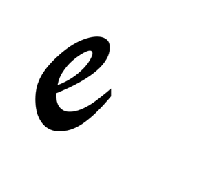
Sketchbook Glyph: /e/
Dilitational


Design Crits
Giving a designer useful feedback requires some thought and tact. Even in the best circumstances, you’re telling a person that what they’ve done isn’t good enough. As a designer, it’s hard to not feel hurt. Here are some tips for participating in productive crits (some of these are from an Adobe blog post).
- Start the session by having the designer talk about the specific goals they have for the design. What’s the user/reader/viewer supposed to get from the design? What’s the context of use (e.g., a poster that distracted pedestrians will pass quickly on the street? Advertisement in a newsmagazine? Opening title sequence for a movie that might be seen in a theater, TV screen, laptop, or iPhone?
- Designers should take notes and ask for clarification where necessary but not defend themselves (even if they disagree with something).
- Focus on the text being critiqued rather than the designer. Use words like, “the design” or “the poster” rather than “you.”
- Ask the designer questions if necessary. And not, “WTF were you thinking?” More like, “I’m not sure I see what the penguin is contributing to this. Can you talk about why you chose that image?”
- Start with positive things to get the discussion going before moving into areas that need work.
- If you point out a flaw, back it up with something factual. For example, instead of “That font is ugly,” say something like, “The overall message of the design is playful and energetic, right? The geometric sans seems a little generic or lifeless. What if you tried something like Mrs. Eaves or Democratica?”
- When you point out an issue, try to offer a suggestion of how to fix it. (See above bullet point.)
Logotype Discussion
Some examples for discussion in Google Drive.
Review project description.
In small groups, share drafts and give feedback.
For Thursday
Lupton 62-72
Bring sketchbook and calligraphy pen.