11.10 Thursday

daily

Roll

Style Sheets in Word

As I mentioned on Tuesday, stylesheets are a good way of making sure your text style categories (heading 1, normal text, block quote, etc.) are applied consistently across your documents. Readers rely on the differences in appearance to understand how text is functioning. When we read a heading, we (without realizing it) set up a cognitive category (for example, “History of Clarkson’s Women’s Hockey”) and as we read the (differently formatted) body text after it, we attempt to understand what we’re reading as a component of that category. The same is true of other categories—block quotes, for example, are usually predicted to be long quotations from another source.

However, if you apply these styles inconsistently, readers can get confused about what they’re reading. Stylesheets are one way of making sure your styles are consistent.

There are three other considerations to keep in mind when creating style sheets:

Pairing fonts: If you’re using more than one font, do all of the fonts seem to work well together (see notes from Tuesday’s class)? Are the more important categories somehow visually higher in the hierarchy (larger, bolder, brighter colors)?

What fonts the user/reader has: If I create a Word document using Helvetica Neue and Garamond and email it to you, when you open it in Word, odds are good that Word is going to display the document in some other default fonts you have on your computer (unless you’re a designer and happen to have Helvetica Neue and Garamond on your computer).

This is true even if you just use the default system fonts—if you’re on Windows and your user/reader is using MacOS, they may not have the same fonts.

There are two solutions to this: Save the document as a PDF or make sure you pick a font that’s on both Windows and MacOS. Here’s a link to a web page that shows what fonts are available on both MacOS and Windows (current versions). This page is written from the web perspective (what fonts can you use on a web page), but the underlying information is the same for Word documents.

I’ll run through creating a stylesheet in Word during class today, but if you’re not able to attend, I’ll post a video version here. (Eventually: I just tested the version I created and the audio is horribly garbled. I’ll re-record it tonight.)

Here’s a link to the page with greeked text that we’re going to use as placeholder text in our document.

When you’re finished creating your stylesheet, File > Save as Template. Change the default location to your desktop and name the stylesheet “Stylesheet YourLastName.dotx”. Upload the file to this folder in Google Drive.

Typeface

Work session for the rest of class.
11.8 Tuesday

daily

Roll

Movie Title Turn-In

Export an .mp4 version.

Package your project and upload it to Google Drive.

Pairing Fonts

  • Serif for body text, sans for headings
  • Don’t go crazy. Probably only need two (or even one)
  • Can just use one font but different styles (e.g., bold, italics, caps, or small caps)
  • Size (especially with multiple levels of headings)
  • Consider using a superfamily (e.g., IBM Plex)
  • Fonts shouldn’t look too similar (readers will just get confused).
  • Fonts also shouldn’t be different in terms of mood/aesthetic. Mrs. Eaves won’t play well with, for example, Courier.
  • Color
  • Use a style sheet to avoid inconsistencies
  • Watch for cross-platform issues

Typeface

Work session

11.3 Thursday

daily

Roll

Sketch 11

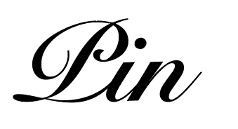
Snell Roundhand Black by Matthew Carter (1966) based on work by Charles Snell (17th century) as a hand-drawn script. Fell into disuse with the introduction of mechanical type due to the complexity of the letterforms.

Typeface

If you haven’t already, read through the Lettering Manual sections I posted in the Typeface Help folder. Then create a Google Doc titled “Type Category” in your typeface folder in Google Drive. In that document, specify what category your typeface will be and describe at least five key features as described in the reading. If there are aspects of your typeface that will differ from the description in the reading, discuss those as well.

Continue Type Tool tutorials (/S/).

Work on lowercase glyphs in Type Tool.

11.1 Tuesday

daily

Roll

Sketch 10

ITC Officina Sans, by Eric Spiekermann and Ole Schäfer (1991). Spiekermann said the typeface was designed for use by new (at the time) laser printers and was influenced by Courier and Letter Gothic. Several distinctive (but subtle) features give the Officina (Sans as well as Serif) a strong, slightly playful identity.

Movie Title

Exporting from Premier.

Name your exported file “Movie Title YourLastName” and upload it to this folder in Google Drive for crit.

Review project criteria and crit (full class).

Type Tips

I’ve posted a PDF of readings covering different categories of type in the Type Tool Help folder. You don’t need to read the whole thing. What you need to do is identify what category your typeface will be and then read that section for tips. You can probably easily figure out the major category (serif, sans serif, script) but some have two or more subcategories, so you’ll need to skim to figure out which yours falls into.

  • Serif
    • Ad Roman
    • Modern
    • Slab
  • Sans Serif
    • Ad Gothic
  • Script
    • Roundhand
  • Brush
    • Brush Script
    • Brush Roman

Type Tool Tutorial

PDF manual (link on Resources page). Skim sections on working with outline layers.

Additional help (in Google Drive).

Some Basics

  1. File > New
  2. File > Font Info…
    1. Family name: Basic
    2. Weight: Normal
  3. Click “Build Names”
  4. Key Dimensions: Can change these later. Can also be adjusted manually in glyph window (will update across all glyphs).
  5. Toolbar items.
  6. View menu
  7. Contour menu
  8. Tools > Customize

Importing Scans: Scan > Photoshop > Type Tool

Photoshop

  1. Download this sample sketch (you’ll do this with your own sketches, later).
  2. Crop to glyph.
  3. Image > Image Size…
  4. Keep proportional (lock) on.
  5. 725 pixels height (let PS calculate width).
  6. Filter > Gaussian Blur. Adjust to taste.
  7. Layers > New Adjustment Layer > Contrast and Brightness. Adjust to taste.
  8. File > Save As… > N YourLastName.png.

Type Tool

  1. Tools > Background > Create.
  2. Tools > Background > Move and Resize.
  3. Click any tool in the toolbar to leave background editing mode.

Uppercase S

Download this uppercase S and put it in the background. Use the pen tool in Type Tool to crease the glyph. Remember to hold the shift key down to constrain the control handles and to use Option/Alt to keep handles symmetrical. Come back later to tweak.

Some Basic Contours

See handout (also, PDFs in Type Project folder).

When done, save your TT file as “Basic Contours YourLastname” and upload it to the same Type Tool Tutorial folder in Google Drive.

No Class Tuesday (10.25)

daily

In case you missed the email:

While technically I’m no longer in quarantine, I’m (in theory) infectious through Tuesday, so I’m going to cancel our class on Tuesday. Instead, we’re going to have individual meetings on Tuesday and Wednesday in Zoom for me to give you feedback on your font sketches.

Here’s a link to a sign-up page (where there’s also a link to the Zoom meeting room): 

https://docs.google.com/spreadsheets/d/1oUcs9zhzH6ALJUoxjVgAM5rbm92dwEdBYWX4h28V7QM/edit?usp=sharing

If you’ve already gotten feedback from me on your sketches late last week or over the weekend, you’re not required to meet again in Zoom (although if you want more feedback, feel free to schedule another meeting).

10.27 Thursday

daily

Roll

Handgloves

Take a picture and post in your Typeface folder on Google Drive. Share & crit.

Movie Title

Share briefs and discuss. Draft 1 due next Tuesday.

Type Tool Tutorial

Links to TT Manual PDF and educational version.

Some additional resources.

Type Tool

PDF manual (link on Resources page).

Additional help (in Google Drive).

Some Basics

  1. File > New
  2. File > Font Info…
    1. Family name: Basic
    2. Weight: Normal
  3. Click “Build Names”
  4. Key Dimensions: Can change these later. Can also be adjusted manually in glyph window (will update across all glyphs).
  5. Toolbar items.
  6. View menu
  7. Contour menu
  8. Tools > Customize

Importing Scans: Scan > Photoshop > Type Tool

Photoshop

  1. Download this sample sketch (you’ll do this with your own sketches, later).
  2. Crop to glyph.
  3. Image > Image Size…
  4. Keep proportional (lock) on.
  5. 725 pixels height (let PS calculate width).
  6. Filter > Gaussian Blur. Adjust to taste.
  7. Layers > New Adjustment Layer > Contrast and Brightness. Adjust to taste.
  8. File > Save As… > N YourLastName.png.
  9. Upload to the Type Tool Tutorial folder.

Type Tool

  1. Tools > Background > Create.
  2. Tools > Background > Move and Resize.
  3. Click any tool in the toolbar to leave background editing mode.

Some Basic Contours

See handout (also, PDFs in Type Project folder).

When done, save your TT file as “Basic Contours YourLastname” and upload it to the same Type Tool Tutorial folder in Google Drive.

Printmaking

Overview and scheduling.

10.20 Thursday

daily

Zoom

For the first part of class, I’ll be joining via Zoom.

Roll

Record yourself as present in the attendance module for 10.20 in Moodle.

Sketchbook: Counterforms

We haven’t talked a lot about counterforms in typography, a term that refers to the negative space within glyphs. Many typographers argue that the counterforms is often the most important part of a typeface. Paying attention to these is important in helping your glyphs feel balanced and able to compose text with rhythm.

In order to visualize counterforms, you can reverse the figure/ground relationship by drawing the negative space in black (with the normal stroke of the glyph being white). Here’s an example from a weblog entry about counterforms:

Notice that, for this kind of exercise, you’re interested in the internal counterform, not the parts outside of the glyph. The /R/ counterform, for example, doesn’t include the space to the right of the letter; just the interior forms. (Those spaces are also important, but more for kerning.)

For this sketchbook exercise, draw the counterforms for /act/ in Bodoni 72 and Helvetica Book (Patrick should have printouts). Start by sketching a bounding box for each letter—just an empty box that is the same shape as each, individual glyph (not the full word). Then use a pencil or pen to fill in just the counterforms. Remember to only draw the interior parts of the counterform, not the spaces outside of the glyph.

Grading

I’ve updated grades and attendance in Moodle. If you see anything missing/wrong (such as grades missing for assignments you turned in late), let me know by email (and list everything in a single email, not scattered across several).

Schedule Adjustments

I’ve made some adjustments to the schedule to give you a little more time to work on the movie titles and typeface projects.

Typeface

Use peer comments from Tuesday to revise your typeface.

See notes from last class (scroll down) for instructions on how to set up your folders and submit your revised glyphs to me for feedback.

Titles Project

Once you’ve submitted revisions to your glyphs for my for my feedback, you can work on the titles project. Start with the Design Brief. See instructions on the project page for setting up your folders in Google Drive.

10.18 Tuesday

daily

Quarantine

My two-and-a-half-year run of avoiding Covid came to an end this week. My symptoms aren’t very serious but I have to quarantine for the week. Patrick’s going to do a Premier tutorial today, then you’ll spend the rest of the class getting feedback and working on your typefaces. If you want me to give you feedback, see the instructions below on setting up a “Variations 2” folder. Otherwise, you can continue to work on your typeface in Thursday’s class.

Roll

Premier Tutorial

Patrick is going to lead a tutorial on how to use the titling features in Premier for the movie project. I’ll walk around and if you have problems, you can ask me for help and I’ll ask Patrick what to do. (I haven’t used Premier since before the pandemic.)

Typeface

Create two new folders inside your Typeface folder on Google Drive: “Variations 1” and “Variations 2”. Take a picture (or pictures) of your current versions and put the files in “Variations 1”.

Start by reviewing the typeface project description.

In teams, crit your font variation sketches. Here are some (but not all) of the things you should discuss:

  • Does the typeface seem to match the design brief? If not, should the typeface be adjusted? Or the design brief? Sometimes, sketching out glyphs helps you come up with better ideas. But if the glyphs just aren’t working, don’t change the brief because that’s easier. For example, if the strokes are just too thin, making the glyphs look spindly and hard to read, don’t revise the brief to say that your goal is to create glyphs that are spindly and hard to read.
  • What variations seem to work best? Why?
  • Across the different glyphs, are there similar features that will help some of them feel like they belong to the same typeface?
  • Serifs or terminals. Contrast. X-height. Aperture. Bowl. Ascenders and descenders. Anything.

Take notes and leave them in your “Variations 1” folder; title the notes document “Variation 1 Feedback”.

Spend the rest of the class working on revisions of your typeface.

Getting Feedback from Johndan

I want to give you feedback on your glyph sketches at some point this week. (This is mandatory, so don’t just skip this step.) To get feedback, you should revise your sketches based on the crit you got in class today. Once you have new versions, take pictures of them and put them in the Variations 2 folder, then email me to ask me for input.

You can do this at any point between now and the end of class on Thursday.

10.13 Thursday

daily

Roll

Movie Titles Project

Added a page with the project description.

Font Project

Review project guidelines. Work on font variation sketches (draft 1 of sketches due Tuesday for criticism).

Type Tool

PDF manual (link on Resources page).

Additional help (in Google Drive).

Some Basics

  1. File > New
  2. File > Font Info…
    1. Family name: Basic
    2. Weight: Normal
  3. Click “Build Names”
  4. Key Dimensions: Can change these later. Can also be adjusted manual in glyph window (will update across all glyphs).
  5. Toolbar items.
  6. View menu
  7. Contour menu
  8. Tools < Customize

Importing Scans: Scan > Photoshop > Type Tool

Photoshop

  1. Download this sample sketch (you’ll do this with your own, later).
  2. Crop to glyph.
  3. Image > Image Size…
  4. Keep proportional (lock) on.
  5. 725 pixels (let PS calculate width).
  6. Filter > Gaussian Blur. Adjust to taste.
  7. Layers > New Adjustment Layer > Contrast and Brightness. Adjust to taste.
  8. File > Save As… > N sketch.png.

Type Tool

  1. Tools > Background > Create.
  2. Tools > Background > Move and Resize.
  3. Click any tool in the toolbar to leave background editing mode.